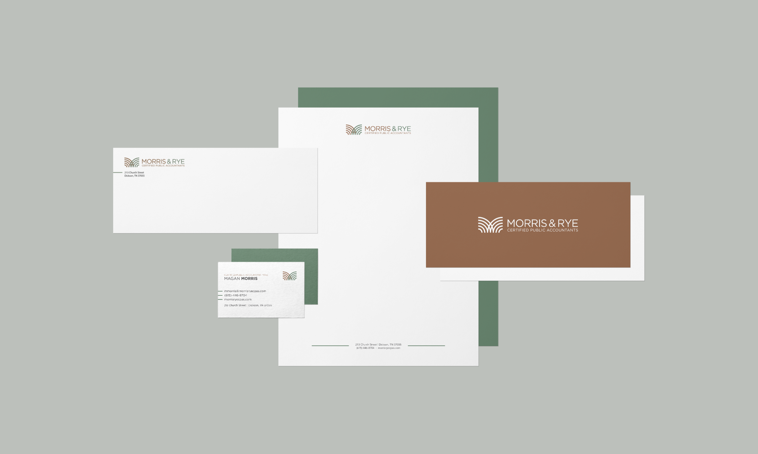
Morris & Rye CPAs
The goal of the Morris & Rye CPAs logo is the spread brand awareness and to be recognizable in the community. The client wanted this logo to have a small town, personal, approachable, and inviting feel. The client’s audience should get the impression that Morris & Rye CPAs is a trustworthy and professional company.
The Morris & Rye CPAs logo mark was inspired by crop rows in a field and bales of hay. The mark as a whole creates a discoverable “m” while a discoverable “r” is seen in the the green quarter circle. To keep in line with the environmental inspirations, I used green and copper. This, again, references rural fields and crops, but also pays homage to the many copper statues and architectural elements in small towns that eventually turn green from patina.
Served as the lead designer and project manager on the Powell Creative team to develop the brand & logo, stationery, and exterior signage for Morris & Rye CPAs.
Logo Mark Development Process


